Wednesday, March 31, 2010

Fandom Hopping: Snermione, Star Wars, and Mortal Instruments


Your Name: GinnyW

The Fandom: Harry Potter

Your Preferred Pairing: Severus Snape/Hermione Granger

How You Got Sucked In: I met some people on a Harry Potter forum who liked Snape... a lot. They kept trying to get me to read fanfiction and I plugged my ears and chanted, "No way. I'll never read that stuff. It's a crime against the original story. Noooooo!" My friends kept recommending one shots and eventually caved, but I didn't get hooked until a few months later and two of my friends were talking to me in a group chat and they were raving about a story updating.

They said, "It's Snape & Granger and it's soooooo goooood!"

I said, "Ewwwwww!"

And then... it niggled at me. Curiosity killed the cat... I went to look and got hooked. It was a Snape/Granger story and somehow the author made me believe that the pairing worked. I was glued to my computer screen for hours, and then I had to have more. I tried some other pairings, including Harry/Ginny, Ron/Hermione, Neville/Luna, & Snape/OFC, however none of them were as appealing to me as the Snape/Granger pairing.

Your Favorite Fic: Cloak of Courage by wendynat, hands down.

However, I also really love:

Lioness Prophecies by amr
His Draught of Delicate Poison by Subversa (really, anything by Subversa, I love her.)
Catalyst by Shiv5468 (she's awesome too, I adore her.)

(What) Have You Written in this Fandom: I've written over 20 stories for the Harry Potter fandom. Most of those in Snape/Granger. The most popular were: To Beget an Heir and A Slip of the Tongue

However, my favourite is: Letters to No One (the 2nd ending)

Good Fan Sites/Archives/RecLists:
WitchFics (I recommend reading The Fire & the Rose there... and its sequel.)
The SSHG Gift Exchange (I still am one of the co-moderators for this. We're in the middle of our 2010 round and have 150 participants.)
The HGSS Digest: A daily LJ post of currently updated stories as well as recommendations for classic stories
The SS/HG Quiz (a weekly quiz with excerpts from Snermione fics... It's really a great rec list.)


Your Name
: emavalexis

The Fandom: Star Wars

Your One True Pairing (OTP): Sorry, but I have two - Han Solo/Leia Organa and Anakin Skywalker/Padmé Amidala

Your Favorite Fic: The Cell by obaona (which, funnily enough, does not involve my OTP, but rather the somewhat-controversial Obi-Wan/Padmé pairing).

(What) Have You Written in This Fandom: A lot of shorter (mediocre) fiction, mostly one-shots involving numerous pairings/groupings, mostly centered around PT (Prequel Trilogy) characters. All publicly posted to my LiveJournal account.

How Long Have You Been There: Well, that's a tough one, because I've been a Star Wars fan my entire life. But I suppose if we're talking 'formal' involvement in the fandom (whatever that means), I've been around since late 2007.

Good Fan Sites/Archives/Rec Lists: TheForce.Net for fandom news and events (and its forums for fan discussion and fanfic alike), StarWars.com for any and all official Star Wars content, Wookieepedia for all of your fact-checking needs (it's a huge universe), Jedi News on LiveJournal for links to all kinds of output in the fandom dating back to 2005, and my own LiveJournal memories list.

How You Got Sucked In: I've been a fan pretty much my entire life. Fanfiction in general, however, came a lot later for me, because I was one of those fanfic-is-wrong, it's-not-real-writing types for the longest time. I actually started dipping into a tiny bit of fic in a couple of other fandoms (Harry Potter, Buffy the Vampire Slayer) for some reason or another and then, given what a big Star Wars fan I've always been, I strayed over to that fandom's fic - and I've really never left. I embraced it with a fervor.

So, Why This Fandom? (Why This Pairing?): It's the fantastical aspect, to be sure (I mean, Jedi? The Force? Come on - what's not to be fascinated by?), but ultimately it's the very relatable human aspect of Star Wars that's kept me around all these years. The relationships. The fun and the heartache. And of course with such a diverse playground of species and planets to play with, there's a near-infinite number of possible situations and circumstances to explore. As for my preferred pairings? Well, I'm a canon kind of gal, plain and simple (though I've been known to read and write almost anything).

Fandom Quirks: It can get a little divisive in the Star Wars fandom. You have your staunch OT (Original Trilogy) purists (who would rather pretend that the PT doesn't exist), your latter-day PT enthusiasts (who have little to no use for the OT), and then you have folks who embrace the whole kit 'n' caboodle. It'd also be pretty easy to assume that all of the fans in a certain age bracket prefer one over the other, but Star Wars fans are anything but predictable. I've encountered a number of fans who weren't even born when the original films were released, yet love them beyond measure.

Other Reading: As mentioned above, Wookieepedia is the definitive Star Wars information resource.

Other Recced Fics: Selfless/Selfish by niicoly, The Senator's Wife by indiefic, Devotio Sacer by fialleril


Name: Katie aka Jeesiechreesie

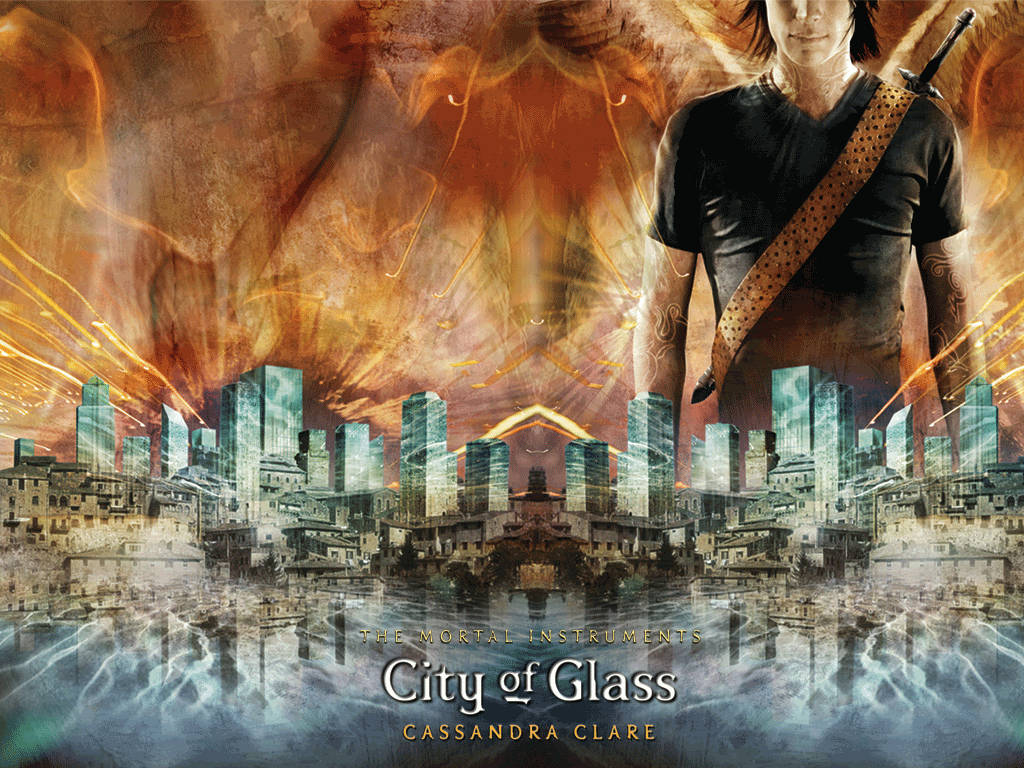
The Fandom: The Mortal Instruments (City of Bones, City of Ashes, City of Glass) by Cassandra Clare

Your Preferred Pairing: Jace and Clary, hands down. (There’s also built in slash ladies, Alec & Magnus is fabulous [and it’s canon])

How You Got Sucked In: I’d taken a brief peek at what TMI fic had to offer after reading the series this last summer, but was in the middle of writing my own Twilight story (which I totally put on hiatus for two weeks while I read TMI). Due to that, I didn’t have the time to devote to wading through the vast abyss of badness to find the gems. Yet I just reread them for the second time and I became obsessed all over again with nothing to stand in my way. I tweeted about them, I made posts about it on Twilight comms, I fought with one of my besties about them. I just needed more more more more Jace. Because guys, I got news for you... this boy can kick Edward’s ass. He’s all balls and swagger with a smart mouth, but with an intensely loyal and protective side. He takes down demons, quips with the best of them, and yet deep down he’s a lost boy that life has taken a dump on and just desperately needs to be loved. The ladies legit don’t stand a chance. So I went on a quest to find the best of the best in a young fandom that’s dominated by one-shots (and arguably bad writing).

Your Favorite Fic: My favorite fic is probably a series of oneshots that begins with Need by Alaylia. It’s what we would call canon AU, and really delves into the struggle Jace/Clary have throughout the books, and the impossibility (way more so than Edward and Bella ever had) of being together. It takes a “what if” situation, sees it through fruition, and then snatches it back. It’s spectacular. There’s another fantastic one by MarcyJ- an old school Twilight writer (Cullenary Education: Forks Sex Ed), Perchance to Dream. It’s simply heartbreaking and angsty.

(What) Have Your Written in this Fandom: I have yet to delve into writing for TMI, but if I ever have time to write again, it’s the next thing on my agenda. It’s even been plotted out, and I want to jump into it right now. With so many well-rounded characters, plot lines, and open-ended scenarios the ideas are endless. TMI is just taking off, and while it’s still rough around the edges in terms of quality of writing, the depth of the plots blow Twilight fics away. I think there’s so much potential as both a writer and a reader in this fandom, and as the books continue, that will only grow.

Good Fan Sites/Archives/RecLists: Pandemonium Club on LJ is a great place to keep track of fanvids, fanfics, news from Cassandra Clare, icons, and discussion. Cassandra Clare’s LJ is very interactive- she answers comments on her posts, and they’re done by her. There are also a couple of outtakes on her site.


Now for recs, I’m going to have to give you them to you myself. I’ve found these by clicking through the favorite lists of any author whose stories’ I’ve enjoyed.

Rogue by ddpjclaf. (complete) It has probably the best IC Jace I’ve seen, though the Clary needs some work. She’s not quite a Mary-Sue, but the author hasn’t really gotten her spot on. Regardless it’s an enjoyable read and keeps you intrigued and readily utilizes all the characters.

City of Ink by NeuroticMuse413: (complete) If you click, don’t be alarmed by the summary, because it’s terrible and really not about that at all. It’s got a lot of great Clary/Jace, but also has a surprising plot twist that is well developed throughout the story.

Sins of the Father by Emily Bowden. I’ll warn you now. Skip the lemons. If you do, this story is good, and has a number of plot strings I could easily see occurring in the fourth book, City of Fallen Angels. It takes Jace and Clary’s notion of being fated to belong together and runs. Around chapters eight through eleven, the plot thickens taking the story in a direction you’d never have expected. It’s not completed yet, but it updates frequently and only has a few chapters left.

Best Fic for a FirstTimer: I’d suggest Rogue or the Need oneshots I mentioned earlier. They manage to capture the essence of the characters and the story line of the books. And if y’all ever want more, I’ve got a list in my email. Talk to me. We’ll flounce Twilight together and ride off into the sunset.
Past Fandom Hops: Draco/Harry, Bones, and Dexter.

Tuesday, March 30, 2010

Affiliates: Project Team Beta


Project Team Beta


PTB has a new look!


Project Team Beta is excited to announce the launch of our brand new site! Our group has been up and running for one full year, and we have outgrown our previous site, a Live Journal community page. After a month of brainstorming, creating, editing, and tweaking, our new site is finally open for business.

Our new site is prettier (thanks to Sammie and Melissa, our graphics gurus). It is much easier to navigate. It offers interactive application forms. And, it allows us to offer our members and the fandom so much more than we were able to before, with things such as: Spotlight, Challenges, Resources, and a F.A.Q.

Please take a moment to browse our new site here: http://www.projectteambeta.com/

Monday, March 29, 2010

GuestEssay: Greeen Goldfish Shows Us Her Mounds

Is that Pronounced "Cl-ih-shay" or
"Cl-ee-shay"?


Greeen Goldfish


My mission that I misguidedly
chose to accept in agreeing to
write this column, is to discuss
fandom clichés in a way that is
“silly, lighthearted, and not
controversial.”

HA.

I scoff because I know that every
time this topic comes up in discussion in
this fandom, I cringe to next year. Why?
Because I am an author. And I know many
of you are, too. And let’s face it: we’ve all done it. We’ve all succumbed to the temptress that is describing Bella’s eyes as “chocolate orbs” or Edward’s as “emerald green.” Or perhaps for you it was having Rosalie release a breath “she didn’t realize she was holding.” Or—holy-mother-of-all-cliches—maybe you mentioned the Kings of Leon. Then you’re REALLY fucked. So how in the fuck am I supposed to talk about clichés in a non-controversial way? Without a bunch of authors getting butthurt?

Now, I am one of those annoying people who does not read very widely in this fandom. Name a fic and I probably haven’t read it. In fact, I was resistant to writing this column at first because I felt woefully underqualified. But then I remembered that I actually DO know all of the fandom clichés because you assholes bitch about them constantly. (And I use the term ‘assholes’ in the most endearing way possible, I assure you.) Also, if you’re an author, this means that you cannot get butthurt because I probably haven’t read your fic, so I’m probably not talking about you! I mean…I guess maybe the people I heard talking about these clichés were talking about you, and then maybe there’s some kind of transitive property involved and you can get butthurt anyway. Since we all know if anyone is going to get butthurt by an attenuated slight that may or may not have been about them, it is twific authors. I KNOW BECAUSE I AM ONE, OK? I’M GETTING BUTTHURT JUST LISTENING TO MYSELF RIGHT NOW.

Sooooo. What can I say that hasn’t already been said? You know what I really want to do? I want to give some examples of cliché-avoidance gone awry. You know what I’m talking about—when an author uses some word or turn of phrase that makes you got ‘WTF?’ so bad that your brain has whiplash. Like when instead of describing Bella’s eyes as chocolate someone describes them as “the color of dried mud on a pick up truck after a rowdy night of going muddin’.” (I totes made that one up, guise, OK? And PS: I’m copyrighting it.) Those get ridiculed even more than the clichés. Or even more cruelly, perhaps. Or maybe it just seems more cruel because that’s when an author is really going out on a limb and writing something original themselves. Except I can’t talk about these here because—yeah---massive butthurt.

Alright, so I did a poll. Lettuce discuss some of these bad boys. I’m going to start with the smutty ones because we all know those are the lulziest and—let’s be honest—you might lose interest in this column and flounce it before we run through the entire list.

Heated core: By far the best comment made about this one was, “[it] makes me think of...magma or something scientific.” However, this particular commenter and I then got distracted and started talking about Ben and Jerry’s. (I don’t know how that happens.)
Pooling of liquid between thighs: I believe the comment was “OMG. EW.” But the best part about the “pooling liquid” was its counterpart, which I had never heard of….The weeping cock: What? I obviously don’t read enough smut. I would definitely remember this one. I just…I dunno…I picture Romeo whispering sweet nothings to Juliet on the balcony and saying, “My cock—it weeps for you.” But I LOVE this cliché, because after telling me about it, someone directed me to THIS: http://community.livejournal.com/weepingcock/. What is that, you ask? That is a livejournal community dedicated to nothing but quotes from lulzy smut.

Oh shit—I totes shouldn’t have given you that link because now you are all reading about “The Velvet-Sheathed Steel That Proclaimed Him Male” instead of this column.

COME BACK.

Oh hai. Thanks for returning. Now let’s run through a few more real quick:

Slits: This makes me think of paper cuts.

Folds: This makes me think of yeast infections. I don’t know why. I guess because that’s where the yeast grows. TMI? Yeah, I know.

Wet pussies: This one is pretty straightforward. This is where I will say, I don’t really read much smut and I don’t write it, but I kind of admire writers who do. I don’t know how they do it. It has to be pretty difficult. Especially when there’s really NOT many ways to refer to weeping cocks and wet pussies that don’t make people laugh or don’t make the reader got ‘wtf.’ Let’s face it—writing smut is HARD. Which brings us to…


Hard cocks (sometimes they even get impossibly harder): Again, pretty straightforward. Should we really be criticizing? (SPOILER ALERT) That’s what happens. Cocks get hard. Do we really want fanfic authors reaching for alternatives, like “The Velvet-Sheathed Steel That Proclaimed Him Male?” I don’t know. Something to ponder.

Shafts: This one makes me think of elevator shafts. Then I think of that movie Speed. Remember in the beginning they got caught in the elevator shaft? I used to be in love with Keanu Reeves. Before I realized he couldn’t act. But still—Jack Traven’s elevator shaft is always welcome in my wet pussy. Just sayin’.


Mounds: Sometimes you feel like a nut. Sometimes you don’t. Almond Joy’s got nuts. Mounds don’t. (OH MY GOD. I JUST NOW REALIZED HOW FILTHY THAT SLOGAN IS.)

Bundles of nerves: Again, this one seems overly scientific to me. I think of nerve endings. But then I try to imagine a bundle of them, and they somehow look like a bundle of twigs and sticks or some shit…only fleshy. I DON’T KNOW, OK?

Dripping….well just about anything drips, apparently: Sometimes I feel like we could go swimming in a sea of Bella and Edward love juices. They seem to be leaking quite a lot.

…And now I need a shower.

OK, so all of those were describing the actual mechanics of teh sexin’, right? What about when the actual sex act itself is a cliché? Apparently there are quiet a few of you who are sick of:

Butt secks: Maybe you guys are just confusing what you’re sick of in fanfic with what you’re sick of in real life?

Bella losing her virginity: How come Bella’s always the virgin, huh? At least in canon they’re both still virgins. And why the devil do we still care? Is this 1893? Are we writing Dr. Quinn: Medicine Woman fanfic? (I am not going to open the whole can of worms about this being teenagers many people are writing about. PSA: Hold onto your V-cards kids. At least until you’re ready. But when I was 11, I totes woulda given my V-card to Sully. Just sayin’.)

Bella orgasms on command: Fuck, man. If only.

Edward’s 15 inch dick: Fucking ouch, man. Please refer to this:


And what about the non-smutty stuff.

(OMG, I can feel you guys flouncing right now.)


Chocolate orbs: Well at least this makes Bella’s eyes more appetizing to me than her freesia-scented blood. Who the fuck wants to eat freesia, anyway?


Emerald eyes: Is that really the only green thing we can come up with? What about grass? What about Heneiken bottles? What about asparagus? ... OK, maybe we should stick to emerald. (Or maybe it’s a good thing I never try to describe people’s physical features in my fics.)


Letting out a breath you didn't know you were holding: I’ve totes used this one. Worse still—I totes used this one even after I had been in the fandom long enough to know better. Is this one in the books? Where does it come from? I DONUT KNOW.

Bridal style: Dudes, I’ve heard people bitch about this one so much, but I had no idea what it was. I had to ask. I was imagining a really freaky sex position. I was so disappointed when I found out it was just Edward carrying Bella across the threshold.

Chagrin: OK, THIS ONE PISSES ME OFF. JUST BECAUSE SMEYER ABUSED THIS WORD DOESN’T MEAN I SHOULDN’T BE ABLE TO USE IT ONCE EVERY 150K WORDS OR SO. IT IS A PERFECTLY ACCEPTABLE PART OF THE ENGLISH LANGUAGE. SO STEP OFF. (See how butt hurt I can get?) But yeah. Apparently fic authors abuse it, too? Or maybe we just notice it every time we see it because Smeyer abused it so much? Either way, I think it’s intriguing that a word can make the leap like that from canon to fanfiction. Do fanfiction authors not read anything other than the Twilight Saga? Does their vocabulary only extend as far as Smeyer’s? (Don’t answer that.)

Pixie Alice, vibrating Alice, Bella Barbie: Now, are these really annoying because they’re clichés or are they just annoying because they’re annoying? Don’t we all want to punch pixie Alice in her pixie face just a little? Not because she’s common but because she’s a god damn pixie?
Also, authors: there were some things that some readers wanted me to pass along to you. Namely:
  • Denali is a place in Alaska, not a last name. Also, it is not a city. It is a park.

  • It does not snow in Forks in June. (Oh wait, that one was for Smeyer, not you guys.)

  • Port Angeles (and Forks) are not huge urban metropolises with loads of places for Pixie Alice and Bella Barbie to shop and get coffee.

  • Texans do not say ‘darlin’’.

  • Abusive boyfriends are not hot.

  • Most straight men don’t know the difference between Gucci and Prada and certainly don’t describe a Fendi handbag in great detail in their inner monologues when eye fucking a girl.

But, dear authors, here is my advice to you: Don’t sweat it if your fic has a cliché or two. It happens. Also, I find readers complain about things that are canon being cliché a lot, but that’s the whole point of canon, right? You’re never going to please everyone. However, if you take one thing from this column, remember this:

Alien sex is never cliché.

(Now let’s all cross our fingers that the TLYDF ladies are feeling momentarily insane and are actually going to link the ET gif I’m providing.)


MOD EDIT: We love you GG....but Alien Porn on a Monday AM is always cliché.


Sunday, March 28, 2010

FanFicRecs: Fantasies in a Different in the Life


FantasyMother's


I present for your consideration...

(Lowering voice to sound like Rod Serling)

Seriously, I’m about as picky a fic reader as you’ll ever find. I’ll accept the occasional typos – even publishing houses make corrections into the 10th printing. At Macmillan, we were still correcting typos in Gone With the Wind. Primarily, I want my fics to be well-written, with a tight plot and consistent characterization. I want it to engage me, make me happy or make me sad, but at the very least, make me feel.

What I never expected was This Is Not My Life by Isakassees.

Rec’d to me by a friend, I pulled it up at work and expected to skim. That was the concept. The reality was, I sat in front of my computer, not caring who expected what from me, and read until I hit the last posted chapter – and cried for more.

Now I have a deal with the aforementioned friend. If a new chapter posts she sends it to me, immediately, without delay, and once again, all work will stop until I’ve savored it.

How to describe this story, yet do it justice? I’ll start off by saying that I believe, without a shadow of a doubt, that this fic can be an original novel, or a film, or both. If it was made into a movie, I’d attend the premier.

Second, the basics: AH, Bella and Edward, a bit OOC, but in a wonderful way. Bella is a normal woman. A successful author of novels geared towards women, she’s happy, she’s healthy, she’s well-adjusted, and she’s joyfully living on her own, working out of her Seattle apartment. I know, drinks are available to those in shock.

Edward is, of course, a doctor – and a relatively young doctor working through his residency. He’s also a single father (I know, not unique) with a little daughter so charming, and so much a child, that she may be one of the best fic children I’ve ever read. I mean that. Don’t let “there’s a kid” put you off. I'm an expert - I raised two of them. She’s a real child – that’s the unique part. Edward is a single parent, devoting his life to raising this child, with the usual suspects around to help. And lo and behold, he’s also well-adjusted. I’ll call for another round. So let’s start our story.

Bella puts down her laptop, realizes she has no food in the house, and runs to the supermarket. Cut to Edward, picking up his daughter and heading to the supermarket. So far, so good. There is a brief meeting between Bella and Edward, a humorous incident between Bella and the child and a pile of fallen apples. Nothing more is said beyond momentary eye contact between our favorite lovers, coupled with a sparkof attraction... when all hell breaks loose.

Little Thing and I started to pick up the apples together while he fetched his cart. I reached over to grab an apple that had rolled a bit further away, lying in between two black boots. I looked up to warn whoever the boots belonged to, when I saw a crazed looking man glaring at me, a gun in his hand.

I flew back towards Little Thing, and he pointed the gun to the ceiling and fired a warning shot freezing me in place. Little Thing screamed, and I wanted to go to her but I was afraid to provoke him. Behind me, I heard movement, but then the gunman's voice rang out.

"Stay right fucking there or die motherfucker."

I assumed Little Thing's dad must have tried to help her, but I could have heard a pin drop after he spoke. I was scared shitless at his cold calm tone. I didn't doubt his words for a second. He returned his gaze down at us then.

"Vicki, what are you doing at the store? You know you're not supposed to leave the house without me."

What. The. Fuck.


Yes, it's James, the villain we love to hate, and rarely has there been written a James so perfectly and humanly unbalanced. He has Bella, and Edward’s daughter, believing them to be his missing family. And so, the story begins.

And you will not be able to stop reading it. Guaranteed.

Why? Because these are real people, with real reactions. Real Amber Alerts. Real, and logical, suspicions that Bella is an accomplice until they figure out who she is. Real police, real investigations - Charlie the Forks Police Chief as both a real cop and a real father torn apart. In fact, I’ll go so far to say this is the absolute, bar none, best Charlie I’ve ever read.

A delightfully quirky Renee, but not so quirky that I haven’t met women like her. All of it progressing the way something like this would – never losing sight that, although Edward may come from a rich family, this Bella is an author with the same level of fame as Stephenie Meyer – and the press is hounding them.

The chapters switch back and forth between Bella and the child, and what they’re going through, and Edward and Bella’s family, and what they’re going through – both heartbreaking, both grounded in reality. All in pain, all in the dark, everyone reacting the way real people would.

The pacing is extraordinary, and the research to pull this off is some of the best I’ve ever seen. And that includes some astonishingly good medical scenes. In the midst of all this, we have Charlie and Edward, two strangers, whose daughters are missing, bonding over their anguish and their fears. The age of the fathers means nothing, no more than the age of the kidnapped daughters. They are two men trying to take strength from each other, where almost no strength can be found.

Bella – brilliant, resourceful, brave – battling to protect the child from both physical and mental trauma, with no regard for her own safety other than making sure that, no matter what, no matter what condition she’s in, she’ll still be able to protect the child.

While underneath it all, you’re still reminded that somewhere, somehow, this is still a love story. Edward learns about Bella, who she is, what kind of person she is, through her father, her friends, by reading her novels. Bella learns what kind of person Edward is through his daughter - this tiny thing trying to remain strong through adversity, telling Bella stories about her family, about her father – her fierce pride in daddy, her unwavering love for him.

I can’t tell you more without giving it all away, but I can tell you it’s not just the kidnapping, but it’s how these normal and well-adjusted people not only get through this horror, but learn to live with what the experience has done to them. It’s a story rooted in strength, and in love, and it never ceases to draw me in, make me feel for them – even make me laugh with them, It’s still a WIP, and I have no clue where she’ll take this, but I know I won’t be disappointed.

In closing, if there is anything I can say to convince you to read this wonderful story, it's this. I wish I could sit down to dinner and a few drinks with these characters, especially Bella and Edward. I wouldn’t even mind if Edward’s daughter joined us.

I’ve never felt that way before.

Note: For those sensitive to certain issues, please note this story may contain triggers.

Who me? I read a lot, and I tend to write Twilight AU, with heavy focus on Bella and Edward. If you want to play in my sandbox, I recently completed The Deluded, and have put up a O/S called A Winter in Chicago, written for the 2010 Twlight Winter Gift Exchange. I also co-authored Perchance to Dream with Lilliput. And I'm an old lady, but I'm still kicking, even if I have to wear support hose while I do it. Eww, sorry for the visual.

Saturday, March 27, 2010

AdminEssay: Sans-Sucky - Part 1: Text Readability and Optimization


Sans-Sucky - Part 1: Text Readability and Optimization


The text readability discussion is one that every person is readily willing to give their opinions on. Do you like white on black? Black on white? Serif? Sans-serif? Italic? Bold? Color? Textured backgrounds? Whitespace? Full-justify?

Well, if you're looking to please any sized audience, then throw your preferences out the window! What you prefer doesn't matter, because, presumably, what you'd really prefer is for someone to read your shit, yes? Right. So is there a standard?

There's a standard for anything, and text readability is no different. I actually attended a few seminars on typography and text-readability back in the day, just for fun. Yes, this makes me incredibly geeky. No, I don't mind it at all. Yes, the seminars were a blast. Yes, I made charts and came home and researched and never stopped. I won't call myself the Goddess of Fonts or anything, but I will admit that, if the title existed, I'd work exceptionally hard to obtain it.

Please Note: These are simply facts and opinions coming from the technical spectrum. I don't claim to know what's best for fiction-writing, nor am I trying to pee on anyone's artistic license. XD

I Shot the Serif


A lot of people make the common misconception that print and on-screen text rules are similar. But our eyes have natural aversions to reading text on-screen. Screens of any type (PCs, TVs, handheld devices) are an actual light source, whereas print (ink onto a surface) reflects and absorbs light. This is an epic distinction, and because our eyes and brains must function in different ways to decipher the text, different rules apply. So if you've ever thought, "Oh, well I like this book wherein the text is all in Times New Roman, so I want to do the same on my story online," then STOP!

Consider this:

For print, serif fonts (ie. Times New Roman) are best for blocks of text, because the serifs (the little tails on the letters) help our eyes easily distinguish the lines and guide us to the next word. However, operating systems have options and settings which smooth and slightly alter serifs (alias and kerning), and combined with the light source of the screen, this makes the text look overwhelming to our eyes. We distinguish all of this stuff happening and we are compelled to jump around and find our places.

Also consider this:

Tip: Readers can change font styles on FFn.


Look at majorly trafficked websites like Twitter and Google. Note their constant use of sans-serif fonts. They have billions of dollars and plenty of statistical analysis at their disposal. If there were more evidence that serif fonts on-screen weren't difficult to read, then they'd be using them, as their top priority is mass appeal.

Sure, there a certainly valid arguments that sans-serif fonts can create distracting optical illusions on screens, and a few studies even show that the type of font used doesn't much matter, but I don't personally or professionally subscribe to this theory, as there are far more studies proving that, not only does font type matter, but it is essential to eye comfort.

The exception for serifs would be headers and titles, and any other text which is generally larger in size and one line or less. In these cases, serifs are perfect, which is another anomaly compared to print, wherein sans-serif fonts would be used for such a thing.

TL;DR - Serifs are eyefuckers.

Serif vs Sans-Serif in the same font size.

Excerpt taken from Chapter 1 of
radiofreeamy
's
Visitation
.

Font-Families


Now that we've deduced which types of fonts are optimum for readability, lets break this down once more and explore different font families!

So long as you're going sans-serif for large blocks of text, you can exercise some level of preference and favoritism. It is important to remember that, though you personally might have 200 fonts installed on your PC, that many people won't. Therefore, you must stay within a certain spectrum of commonly installed fonts. What are these fonts?

Below is a list of commonly used fonts, and the operating systems they come bundled with. (from upsdell)

GenericFontWindows
2000/XP
Windows
Vista
Mac
OS X
Linux
Unix
serifCambriaVista FontCommon Font  
ConstantiaVista FontCommon Font  
GeorgiaCommon FontCommon FontCommon FontCore Web Font
Palatino LinotypeCommon FontCommon Font  
Times New RomanCommon FontCommon FontCommon FontCore Web Font
Times  Common FontCommon Font
sans-serifArialCommon FontCommon FontCommon FontCore Web Font
Arial BlackCommon FontCommon FontCommon FontCore Web Font
Arial NarrowCommon FontCommon FontCommon Font 
CalibriVista FontCommon Font  
CandaraVista FontCommon Font  
CorbelVista FontCommon Font  
Helvetica  Common FontCommon Font
ImpactCommon FontCommon FontCommon FontCore Web Font
Microsoft Sans SerifCommon FontCommon Font  
TahomaCommon FontCommon FontCommon Font 
Trebuchet MSCommon FontCommon FontCommon FontCore Web Font
VerdanaCommon FontCommon FontCommon FontCore Web Font
cursiveComic Sans MSCommon FontCommon FontCommon FontCore Web Font
monospaceAndale MonoCommon FontCommon FontCommon FontCore Web Font
ConsolasVista FontCommon Font  
Courier  Common FontCommon Font
Courier NewCommon FontCommon FontCommon FontCore Web Font
Lucida ConsoleCommon FontCommon Font  


My own personal faves for block text are Tahoma and Trebuchet MS, though many websites, like fanfiction.net and default Google Docs, use Verdana. This is all personal preference, of course. For titles and headers, you can get a little more creative, and I much enjoy the use of Cambria and Impact (which is a sans-serif, but not suitable for block text).

Keep in mind that those optical illusion issues mentioned above are caused by the Arial typeface. It is widely avoided because of this.

In the evnt that you're setting fonts geek-style, it's always an excellent idea to make font "stacks" when setting families in HTML or CSS. This means that, instead of choosing one, we give the browser a back-up option that is most like our original. We do this because font style is important to design and readability, and sometimes, whatever the browser defaults to when your first choice isn't installed on the browsing machine may be far from what you intended.

Font stacks will look like this:
<font face="Tahoma, Trebuchet MS, Verdana, Sans-Serif">My kitties are pretty.</font>

So the first font the browser is going to look for is Tahoma, and if it's not present, it'll look for Verdana, and if that's not present, it will default to your operating system's sans-serif.

Font-Size


The biggest factor in the previous two sections is going to be text-size. Smaller text is best in sans-serif, and larger text is best in serif. The optimum font size for large blocks of text is 12px (or 9pt), though you have +/-1px breathing room. Headers and titles require anything above 16px.

Line-Height


Tip: Readers can change line-height on FFn.
Line-height is probably one of the best, least used methods to optimize readability. I think people mostly overlook it simply because they don't consider line-height to be as important as faces and sizes, but it is. A nice, robust line-height expands white-space and assists our eyes in traversing lines of text. In layman's terms? It's just so comfy!

How to set line-height?

Fanfiction.net, like font faces, sizes, and colors, allows you to set your preferred line-height. Try playing with this some time! Test it out, get a feel for the differences, and see if you enjoy it more.
<font style="line-height: 200%">
<font style="line-height: 20px">
<font style="line-height: 1.5pt">

These are good, comfy amounts of line-height for 12px text.

0 Line Height vs 1.5pt.

Excerpt taken from Chapter 5 of
radiofreeamy
's
Visitation

Double-Spacing


As late as 1941, the practice of using double spaces to separate sentences was still alive in the U.S., as seen in this extract from Damon Runyon. Within the following few years, the practice became all but extinct in commercial publishing on American shores. Source.
You ever run into those hoity toity types who tell you that it's "proper to double space after a period?" Yeah, and then you kinda snort, and you think WTF? Really? And then, if you're me, you Google that shit quick-like, because, woah. Never learned that in English.

Well, some people do this, and the "proper" term is an "em-space." You know, kinda like how the "em-dash" is a long version of the plain-dash. Basically, it's this totally archaic deal in which some old mofos started this trend, be it for commerical printing profit conerns or whatever else, and it was apparently "all the rage" back in the 1770's. There was no real discernable purpose for it back then, but then with the eventual invention of the typewriter, em-spacing was actually proper, typographically speaking. This was due to the fact that typewriters use monospace (every letter and space is the same width) characters, and allowing the extra space made it so the carriage moved a fixed amount after every keystroke. Its benefit was strictly mechanical.

But we aren't working on a typewriter, and we aren't a bunch of penny-pinching old dudes, so there's no real purpose to em-spacing. I won't say there are any adverse effects to using it, however, aside from that of the reader stopping to wonder, "Wait, why are there two spaces after every sentence?" And anyone out there who thinks their use of em-spacing equates to their shit not stinking can just gtfo.

Justify My Love


Okay, so it would seem as though I commonly break the rules here, but I can explain why.

Justify is the perfect spacing of text that is flush to both side margins.

Why is it bad? Well, depending on the content of the text, it can cause major readability issues, such as something called "rivers of text." It also takes away important visual line cues---kind of like seeing a staggered line and knowing when you jump back to the other margin where your place is.

There are different levels of justification, however, and used in the proper way, many issues regarding justification can be avoided.

Full-force-justify will make the text margins a perfect square. This is the worst of all justify options, as the white-space it forces can be dramatic and jarring.

Simple justify will simply move text around to accommodate the justification, leaving the final line of text shorter or equal to the rest, however necessary. This lessens the problems with dramatic white-space and still allows you the perfect margins, in the event that you're doing an article like this, or wishing to show images with your text wrapped around it.

I like the look of the straight flowing lines justification offers, but consider what you're using it for. Large blocks of story text probably aren't an ideal place to play with it.

Non-Justified text vs Justified.

Excerpt taken from Chapter 12 of
radiofreeamy
's
Visitation

Swanky Italics, Bolds! Sarcastic Strikethroughs, and Ultra Uber Underlines.


Aldus Manutius, famous printer, inventor of italics, and EPOV mindreading pioneer.
Italics are most efficient for the purpose of showing us what's thought versus what's spoken, and for emphasizing words or short phrases.

But with great power comes great responsibility.

Italics, like all wonderful things, should be used in moderation. After so long reading italics, you eyes go all crossed and itchy. How much italicized text is okay?

Well, in the case of italics, sans-serif fonts are actually more difficult to read on-screen. IKR? All of these fucking conditions, so annoying. But keep in mind that the purpose of italics is to emphasize words or short phrases (cwidt?). It was never meant to emphasize enormous blocks of text.

As a personal rule, I always prefer to italicize when the sentence is two lines or less. I know, this can't always be followed, like in instances where Carlisle is thinking a particularly lengthy medical explanation to Edward, etc., but we should aim for brevity! I mean, we've all gotten to that point in a story (I've done this before myself, so no hate) where an entire scene will be in italics. We see this daunting page full of slanty text and involuntarily groan. We kind of wanna skip it, yeah?

Full journals, diaries, letters, flashbacks, and anything else more than a couple paragraph is definitely too long to be italicized comfortably. In these cases, I suggest (no hate mail, please) use of a horizontal line (<HR>) or one of your very own fancy scene markers to separate it from the main text. Our eyes will thank you.

Bad:
In WA,
chapter 47
, I jump from ENORMOUS blocks of italicized text to non-italicized text several times. Obviously, I could have used a horizontal line or my signature scene marker (---) to split these up, and it would have been more comfortable. Instead, we're adjusting our eyes like a gabillion times. ~slaps own hand~

Good!:
Addicted to Edward Cullen
, the author of
Music of My Soul
has two flashbacks in
chapter 4
, but as you can see, she made such a flawless transition from present to past that italics weren't necessary.

Once I could stand straight again, I wandered aimlessly around the perimeter until I spotted a group of computers arranged in a ring around a circular table. I sat at an available one and clicked the "Log in as Guest" button. While I waited for the computer to finish doing its thing, I gazed at the shelves across from me. "Classic Literature" read the sign above the shelves.

A small smile formed on my lips.

I'd been walking by the narrow aisle of Classic Literature books in library at Forks High School when I'd noticed a girl with long brown hair stretching to reach a book on the very top shelf. She was standing on her tiptoes on a small step stool, apparently not realizing her feet were off-center and causing the stool to begin to tip.

Also Good:
Unholy.Obsession
's
How to Save a Life
outtake,
Miss Mad World
shows various journal entries, along with the thoughts of Bella, who is reading it. Instead of using italics to make us distinguish journal entry from internal dialog, UO uses scene markers, and this, coupled with the inherent context of what's being read, is more than enough to help us distinguish.

There was nothing left in me that wanted to turn the page. I wanted to go back in time, I wanted to leave the diary lying there, I didn't want to be aware of such ugliness. But I already knew that ugliness like this existed in the world, through no one's fault, and I couldn't stop now. I flipped to Tanya's final entry. I braced myself for what I knew was coming. The end.
3/18/09

Dear Diary,

It is 2:30 PM. I did not go to school today. I still haven't slept. But I've been busy. I've been so very, very busy and you want to know the best part? My mind is quiet. My mind is finally, finally, finally blessedly quiet and I have some peace of mind.

TL;DR - Step away from the CTRL+I.

Bold
should be used in even greater moderation. Its purpose is to draw attention, and if you've ever seen a chapter/flyer/article/etc with many words or phrases bolded, you know what I mean when I call such things, "The bold that cried wolf." When so many items are being flagged as important, then are they really important anymore? Not really. And then, there will come a time in the text when something really is important, and no one will believe you.

Fail.

Bold causes a big readability issue, since items are competing for attention, but it also causes extra noise issues that we just don't want.

When you're about to press the big "CTRL+B," consider if the same effect could be achieved by italicizing the text instead. Then, apply the above rules for italics to consider if the same effect could be achieved by using horizontal lines or scene breaks.

TL;DR - Bold is last resort.

I rarely see
strikethroughs
used for anything other than sarcasm, visual scribbles (like in journal entries), beta editing, or, if we're being proper, to depict the crossing out of an item from a list. Fanfiction.net doesn't allow you to use strikethrough, however, so keep this in mind when writing, so as to avoid any embarrassing "was meant to be crossed out, but now it's not" situations.
  • Sarcasm:
    No, I didn't eat dinner, especially not Cocoa Puffs.
  • Visual Scribbles in Fiction:
    [Study Hall Note to Alice]
    I guess you can come over after school. Is that a curling iron in your backpack?
  • Beta Editing:
    "This is dumb," Edward said shrewdly.
  • Crossing Out from List:
    Bacon, eggs, bread, muffins, Cocoa Puffs, hot dogs, grapes.
Unless you're emphasizing a hyperlink, title, subtitle, or are trying to be intentionally funny, just don't use
underline
. Ever.

ALL CAPS: THE VIRTUAL YELLLLLL


STOP SCREAMING AT ME. I DON'T CARE THAT BELLA IS LITERALLY SCREAMING AT EDWARD IN CHAPTER FIVE OF YOUR FIC. THIS IS NOT COOL. AN EXCLAMATION MARK AND A DRAMATIC DIALOG MARKER DOES THE JOB SO CAPS-LOCK DOESN'T HAVE TO, KNOW WHAT I MEAN? I HAVE NO FANCY STATISTICAL EVIDENCE TO PROVE WHY ALL CAPS IS SO FULL OF SUCK.

IT JUST IS.

The Color and the Shape


Tip: Readers can change color schemes on FFn.
What is easiest to read? Dark on light, or light on dark? The truth? It doesn't matter. If you're using sans-serif fonts of a common font-size with all other comfortable elements, then this shouldn't matter. The font should be comfortable to read either way.

BUT...

Again, take a gander at majorly trafficked websites such as Google and Twitter. They use dark text with a light background, and I've never seen anyone complain over Google's totally annoying white background and black text.

If you're playing it safe, go black on white.

If you're looking to be a little adventurous, then consider the brightness of font colors versus backgrounds. Stark white on black is harder to read than stark white on dark grey, or light grey on stark black.

Here's a
neat little tool
that will allow you to experiment with variations. As you can see, it'll alert you whenever the readability alogrithm catches a combination that's difficult or impossible to read.

Some Good Contrast Variations; Light and Dark:


Excerpt taken from Chapter 8 of
radiofreeamy
's
Visitation
.

Fun with Titles!


Super Awesome Title

The title above was created using the CSS tags, font-variant and letter-spacing.

<b style="font-family: cambria; font-size: 16px; font-variant: small-caps; letter-spacing: 3px; color: #26FFF4;">Super Awesome Title</b>

Other than my use of serif for a title, I have no fancy statistical or scientific evidence to prove why this is cool.

It just is.

Block Text Width


Tip: Readers can change page widths on FFn.
So, fanfiction.net has this neat little option which allows you to control the width of the text you're reading. Some authors will tell you straight up in their A/Ns to set it to 3/4 or 1/2, as opposed to the full screen width that is FFn's default.

Why?

Well, our screens are really wide. I remember back in the old days when it made sense to optimize all designs to 800x600. Now, the notion is almost laughable. Who the fuck still sets their screen resolution to 800X600? (My mother doesn't count.)

Now, the laughably small screen resolution is 1024x768. We usually go larger than this, what with the advancement in graphic card technology over the years. This means that our screens are wiiiiiiiiiiiiiiiiiiiiiiiiiiiiiiide.


Tip: Authors can change page widths in Google Docs.
It's just easy as fuck all to lose our places, see. We have distractions, noises, eye jumps, attention diversions, you name it. It takes us more time to read an entire line of text on full screen width. Plus, keep in mind that we're seeing all this text and barely any whitespace. Ouch. It's a little daunting.

Therefore, it's a pretty good idea to make block text a fixed-width. In FFn, we, as authors, have no control over this, but as readers, we do. I always read on 1/2 screen (and I use the dark scheme with high line-height, but you dgaf about this).

Fortunately, we can control our block widths in other places, such a Google Docs and any posting location that allows HTML.

Important:
Never use pixels to define width in HTML. There are too many screen-size possibilities within your audience. Instead, always use percentages..

In conclusion...


The nature of screen-based text is more important than many realize. Consider how many hours per day we spend reading text from a screen. This shit can get painful. Whether you're doing a blog, making an archive, posting a story to LiveJournal, or just creating a PDF or Word document, you definitely want to make your audience as comfortable as possible.

As I stated ^^^ up there, this is all coming from a technical web spectrum. Thus far, I've found no reliable resources that are specific to on-screen text readability with literature in mind. I think it's a credit to the advance in times that it's probably becoming common enough to consider it, though.

Sources:
Creative Pro
,
hgrebdes.com's Color Theory
,
Typeface Blog
,
WebDesignFromScratch.com
,
Skills for Access
,
The History of Linear, Sans Serif Typefaces


Next time, the real fun begins!


Big thanks to
catonspeed
for the font humor (I lost that link, goddammit!),
radiofreeamy
and the other Twitter gals who volunteered their fics to be excerpt'd, and @dotpark3r, just because she always get my lame ass font humor. And you. For reading this boring shit.

Spread The Word